
Minimalism in Web Design
- By Joe Wozny
- •
- 11 Jul, 2019
6 Guidelines for a Great Visitor Experience

Minimalism in the world of design is everywhere - in architecture, paintings, sculptures and even in our lifestyles. This is initially driven by design and as it catches on becomes a consumer’s choice.
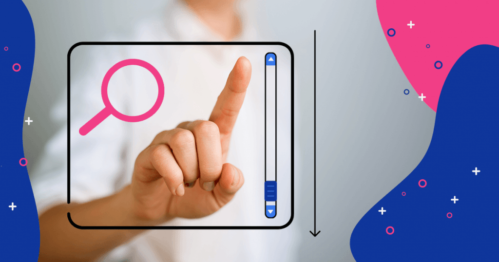
Minimalism is also on the rise in digital product design. Well-designed “web minimalist website interfaces" pair aesthetics with strong usability to create an excellent user experience. Template driven websites provide multitudes of white label minimalist examples.
While minimalist web design is attractive, it is tricky to get just right. In order to help you decide what parts of minimalism you should embrace we share six rules for creating effective minimalist designs.
The Top 6 Guidelines
Content and Features - Remove all unnecessary elements and distractions from your design. Conduct a content and feature analysis. The goal of this activity is to prioritize all content and features, so you can identify what the essential components of the design are.
The more choices you present, the longer it takes to make a decision so reduce the options and features presented. Choose elements that serve a functional purpose. Only include elements that make your message clear. Communicate succinctly. Place the most relevant content at the top.
Imagery - Minimalism includes careful choice of when and where to use images. Thoughtfully choose images that help create a focal point with asymmetrical and symmetrical balance.
Typography - Good minimalist design features clean and readable typography. Typography can be used to create focal points. Select font pallete with one or two font families. Text blocks make it easier for visitors to understand and consume the content on your site.
Colours and Contrast - The colours you choose should be as clean as your typography selection. Color can be used for various purposes including as a background texture or as an accent, or to convey a mood. Keep in mind that monochromatic colour palettes are not the be all and end all of minimalism. While it’s always better to use a limited number of colours, you should not be limited by your colour selection.
White Space - Visual clutter can be your worst enemy. Avoid having too many items fight for a visitor’s attention. In fact, use white space to force a user’s attention by increasing negative space around it. Empty space will naturally direct the eye towards the object. Avoid using multiple focal points per screen. Give visitors one thing to focus on at a time.
Visual Hierarchy - It’s said that “Good visual hierarchy moves the visitor’s eye across the page and pulls attention to certain elements.” Grid systems are effective tools to assist with achieving visual hierarchy.
Bottom Line: Find the right relationship between all the visual elements you use in a design and the visitor experience you want to provide. A well-balanced design ensures no one element will overpower the other without a good reason. When you strive for minimalism, what you are actually doing is creating simple, easy-to-use products—products that help the user accomplish something quickly and easily. This leads to first rate visitor experiences your clients will remember.